TELE HEALTH “LIGHT” app
A need for a more condensed and faster to market app became an apparent need for our company. Gemini light is a win to users who want fast and simple access to care, a win to developers who can make one package and a client can self customize, and a win to the team as a whole when we can make care accessible for smaller practice healthcare systems.
Role: Designer, Worked with team Lead: Davor Anic
Small Hospital systems needed a quicker to market product
THE PROBLEM
Frequently the sales team was providing feedback that potential clients were too small for our “advanced” or highly custom app.
Feedback from sales indicated clients were intimidated by the cost of the app, or the clients felt that their hospital system didn’t need the features provided in a large scale application.
KEY SOLUTION ELEMENTS
Out Of The Box
We needed to create a solution that clients could get “out of the box”. Clients would only need to provide colors, features and a single photo for the app to be up and running.
QUICK
Customized and prototyped to be presented to clients for sales pitch.
Quick to the market. Minimal dev and design time meant we could promise clients a product that would be on the market within the month.
FLEXIBLE
This solution thrives on a “plug and chug” mentality. But hospitals are unique with different circumstances. We needed to build the system to have room for edge cases and unique hospital needs.
this is the process of DESIGNING:
A ONE PAGE DIGITAL BINDER APPLICATION
CREATING STRUCTURE
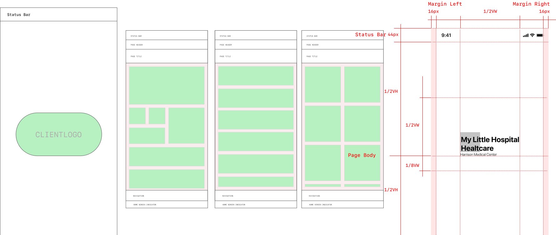
Our team created a modular system that would be flexible to work with an array of many different hospital needs. We began by breaking down the basic necessities and exploring structurally what would work best for user experience.
CARDS
The design teams original idea was to create multiple sackings of cards to create sections, and visual texture. This would let us create related blocks for better organization and create a hierarchy based on frequent needs of users
Tutorial Screens Process
Users would need to have an introduction to using the app that was flexibile to be branded by multiple hospitals
1.Started with wireframing
2. Internally playing with colors and custom icon illustrations
3. exploring custom illustration
The final tutorials screen solution works for both android and ios, and includes a library of over 20 illustrations for potential tutorial screens
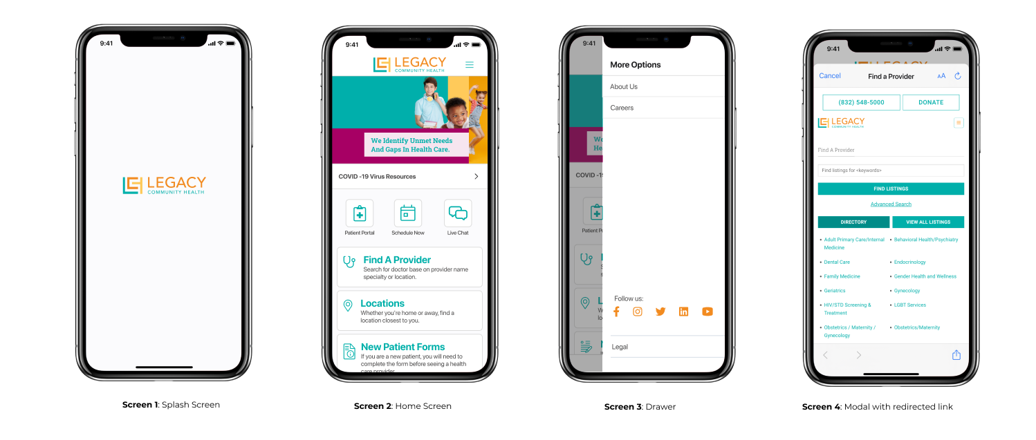
Final Screens
MAKING A MODAL
The design team found that the least disruptive way for users to experience the app (without being taken away from the app) was by using a system modal.
This would link users to the necessary content where they could quickly navigate to and from wherever they wanted, within a packaged experience.
MVP ALIGNMENT
Our initial proposal was full of variety of shapes, salutations and color. It featured a bottom up drawer and simplistic buttons. It featured all new components and style guides (when compared to our “advanced app”)
After meeting with our product team we quickly saw this was too complicated for the dev team (after a company restructure our dev team was seriously short staffed mid this project) , we needed something that they could make with their limited time. The design team concluded the fastest turn around was repurposing our advanced apps components and code.
*SPECIAL MENTION
PROTOTYPING WITH PROTOPIE
The design team was proud to contribute the initiation of Protopie (a new interactive prototyping software) Which further quickened the time this product could hit market and worked within our team limited dev time. This contribution led to several sales for our ‘lite’ version of the product.
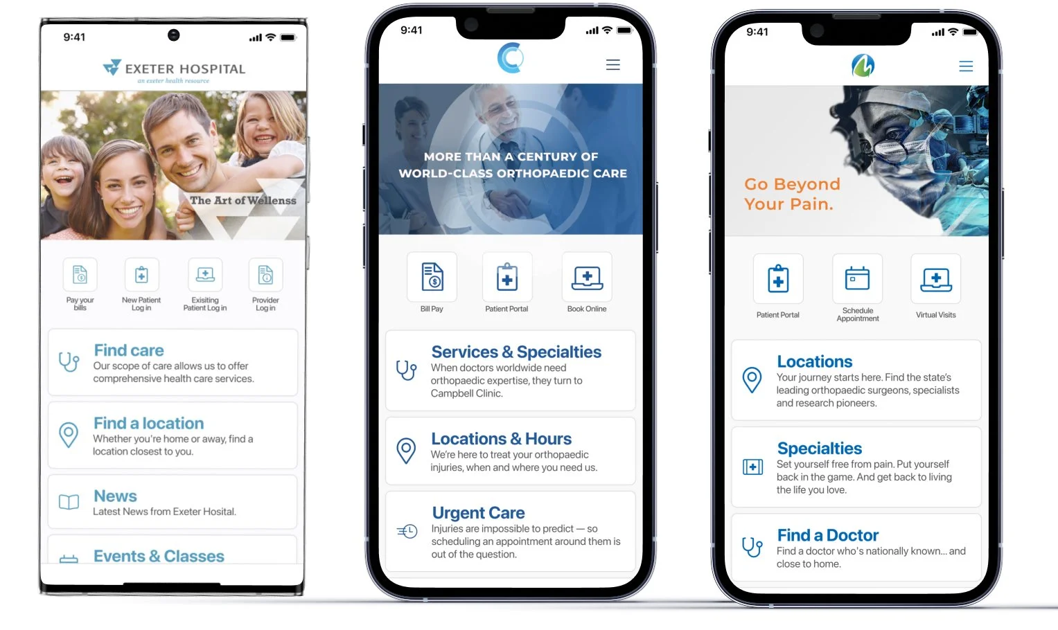
A quick to market app thats flexible to accommodate multiple brands
THE FINAL PRODUCT
CURRENT PRODUCT
This product is one the design team is proud of even though its a deviation from our proposal. It still offers the clients an in budget app and give their patients something to make healthcare more accesible. The design offers flexibility to a variety of systems and can easily be branded to fit any clients needs.
THANKS FOR READING!


