FIND A DOCTOR FLOW & UI
Finding a Doctor is one of the primary functions of many of our hospitals. I wanted to streamline the users experience and offer actions that made seeing your doctor even easier.
Role: Designer
find a doctor flow and cards are chaotic and make it hard for the user to reach desired endpoint
THE PROBLEM
Touch zones were awkward, information was disorganized and doctor / location cards needed a modern facelift. In many cases it lacked key actions users needed, when they needed it.
KEY SOLUTION ELEMENTS
Meeting User Expectations
Former designs didnt meet user expectations, touch zones were awkward, information was disorganized and doctor cards/ location cards needed a modern facelift.
action rich
There’s a lot of variables we need to consider for users to find a doctor. Some users need to use a ride share, some will need to schedule appointments, maybe look at reviews before determining if that doctor is right for you. The list goes on, an action rich provider card empowers users to make informed decisions in a easily digestible card.
Clean ui
Previous designs lacked hierarchy and clarity, and were just overwhelming to look at. Users needed clear UI to support finding the information they needed faster. This allows them to compare doctors quicker without exploring multiple pages.
this is the process of DESIGNING:
A ONE PAGE DIGITAL BINDER APPLICATION
COMPETITIVE ANALYSIS
I looked to Air BNB and Google for a competitive analysis to understand how a user decides to purchase a “product”. I came to the conclusion that we were selling doctors to our users, an appropriate solution was to use cards to package them like a product.
I took inspiration from Google’s stacked actions (call, directions, order online, etc.) to mirror actions user would need to take for doctors. Likewise, Airbnb provided their users with ratings, photos and badges to describe certain locations.
USER TENSION
These cards had so much irrelevant information to the users, colors that weren't accessible(according to ADA) and clicking at the wrong point on the card would open an Uber/ Lyft modal instead of telling the users more about the doctor (going to a location page - expectation.)
PROPOSAL FOR CARDS
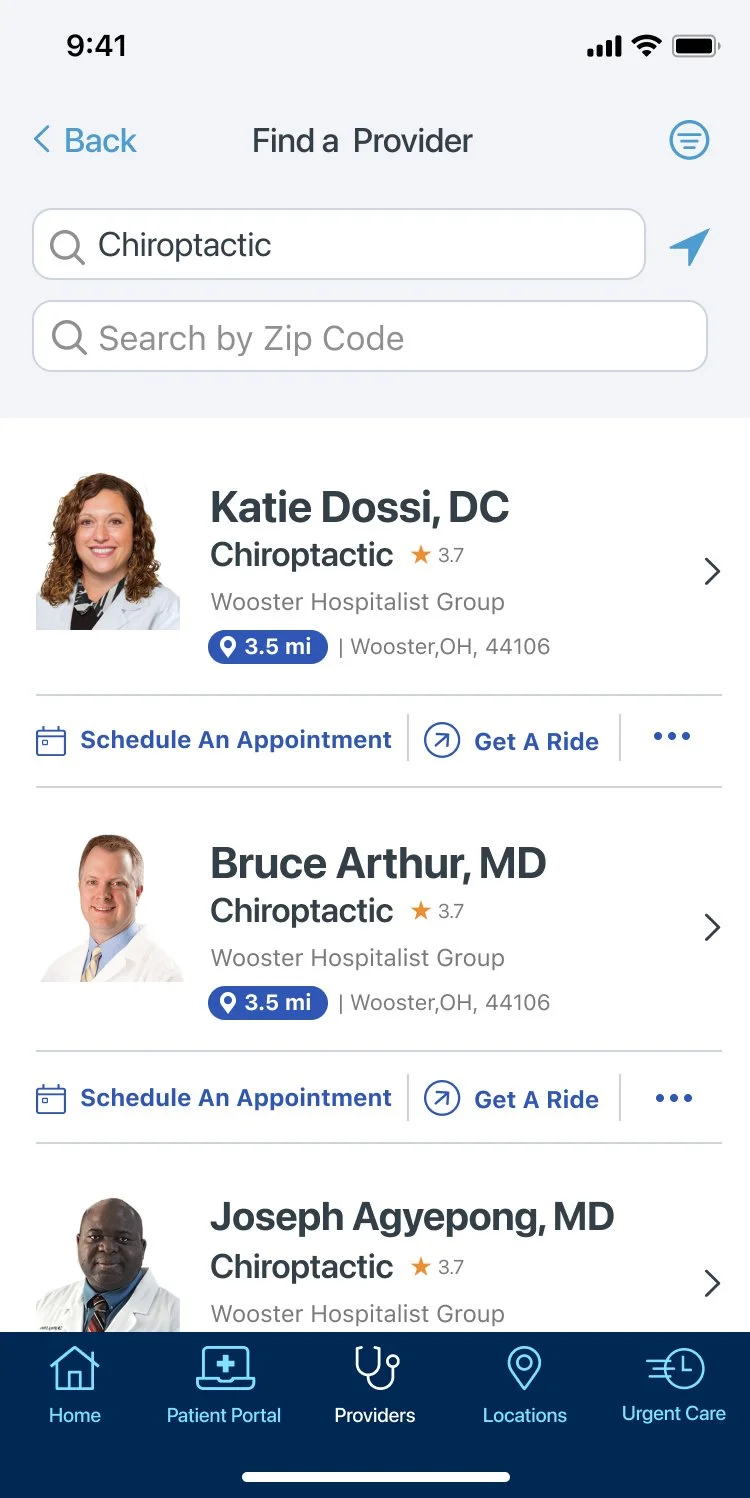
The design proposal included creating cards that gave users more information and engagement options.
The new designs provided better hierarchy and added relevant information.
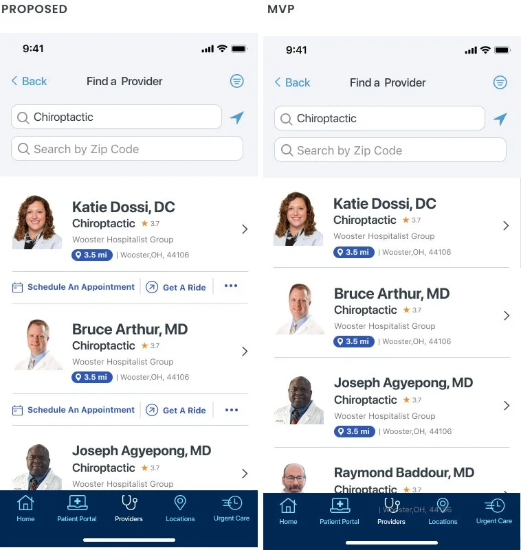
The proposed design would give users key information on whether or not that doctor would be right for them. They could also engage by scheduling an apointment right away instead of nesting it in the profile. An additional sheet modal gave users more options such as calling or reading reviews (stats told us that these were less used options)
PROPOSAL CONTINUED
Applying the same principles from above, I prioritized informing the users about the doctors. This was done through creating a more organized hierarchy and strong call to actions. Inspired by google and the idea to market doctors like a product I used a section with a large button and four quick links.
THE MVP
COMPROMISING
A minimal viable product variation of this design was made to accommodate a need for developers who would need more time to create code around Quicklinks. The MVP card is essentially the same, condensing the cards up to the final line of text in the doctor bio section.


